New design for new markets
Design relaunch for SweetFamily by Nordzucker
The background
The assortment of Nordzucker SweetFamily has grown over the years. Due to many added specialties, the appearance is no longer homogeneous.
At the same time, changes in the sugar market mean that brands must also operate globally. For this, the manufacturer Nordzucker is fully relying on its product brand SweetFamily.
Our task
- Development of brand strategy and brand architecture
- Design relaunch of the entire Nordzucker SweetFamily range
- Accompaniment of market research
Upgrading the product brand SweetFamily
SweetFamily is at the forefront of the new brand architecture. The regionally varying manufacturer becomes the sender.
This way Nordzucker backs SweetFamily. The new logo enhances the product brand.
New design, better orientation, strong impulses
Our brand strategy puts the product brand SweetFamily in the foreground. We stage it as a global brand and upgrade it significantly. The manufacturer Nordzucker becomes a mere consignor, which provides flexibility in international markets.
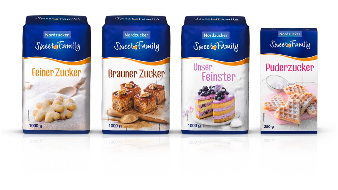
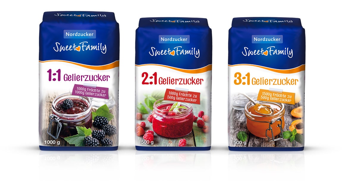
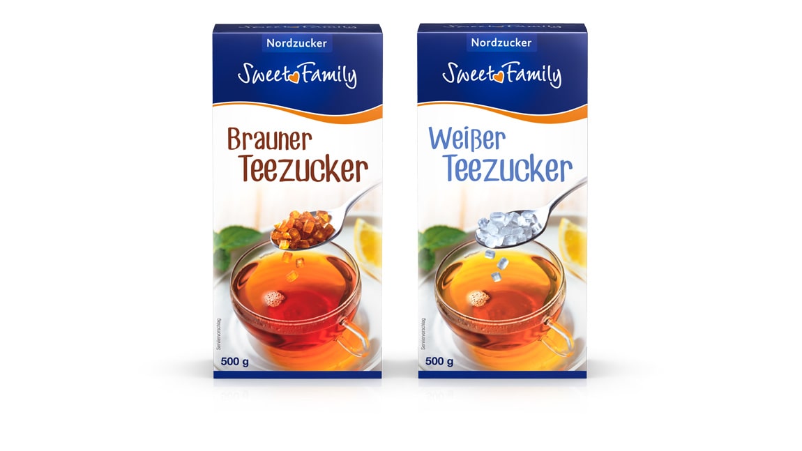
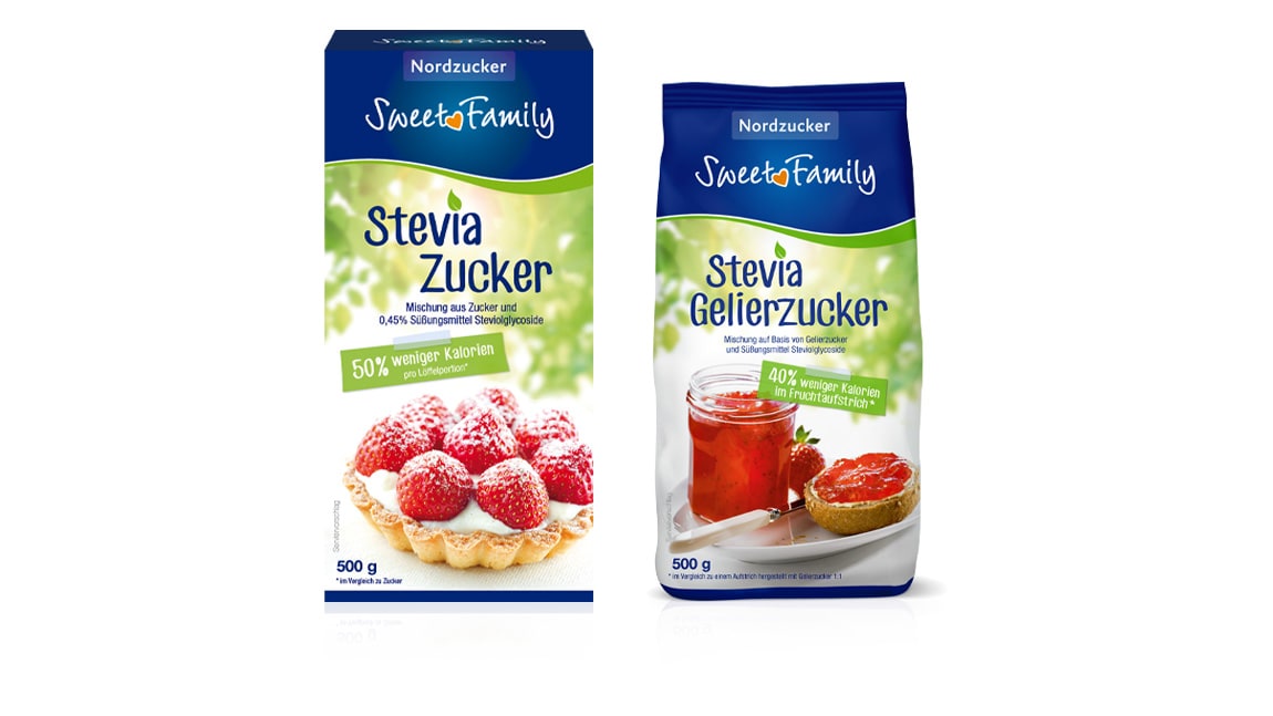
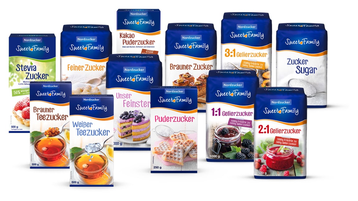
The new design picks up on the traditional blue of the brand and sets new impulses: We unify the appearance across the entire product range and stage SweetFamily in a sweeter, lighter and more modern way. The revised logo gains in radiance.
As an additional element, we are establishing the new, blue-orange packing-wave that separates the pack roof and the image motif. In an extensive photo shoot, new, particularly appetizing product images are created in a contemporary image concept. This way, we give the SweetFamily packaging an attractive and high quality look.